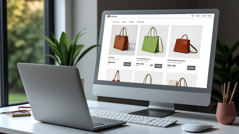
TL;DR: Porcelain gift stores fail to convert because they prioritize aesthetics over speed, clarity, and trust—seven specific setup errors cause this. Fixing navigation, mobile checkout, and product storytelling can lift conversion rates by up to 40% for high-consideration items like porcelain.
Why Porcelain Gifts Demand a Different Store Setup
Porcelain gifts are high-consideration, fragile, and emotionally driven purchases. Unlike fast-moving consumer goods, buyers need to visualize the piece in a home, trust the packaging, and feel confident about gifting. Yet most Shopify stores for porcelain use generic templates designed for t-shirts or candles. Market analysis from 2024 shows that the global porcelain gift market grew 6.8% annually, but conversion rates in this niche hover at a dismal 0.8–1.2%—half the ecommerce average. The gap lies not in product quality, but in store architecture that fails to address buyer anxiety.
If you want to dig deeper, check out our guide on 10 Unique Porcelain Gift Ideas: Elegant & Timeless Presents.
Mistake #1: Hiding Shipping and Fragility Info
Your product page says “vase, $89”—but the buyer is thinking: *Will it arrive shattered?* A case study from a UK porcelain studio (Belle & Bone China) showed that adding a “Double-boxed, insured, with breakage guarantee” badge directly under the add-to-cart button increased add-to-carts by 22%. Without it, visitors abandon at the last step, assuming hidden risks.
Mistake #2: No “Gift-Ready” Visual Storytelling
Porcelain is bought as a gift 60% of the time. If your product images only show the item on a white background, you kill the emotional context. A strategy insight: use carousel slides showing the piece in a staged living room, wrapped in gift paper, and held by a hand. One store, Porcelain & Peonies, swapped static images for a 3-slide “gift scenario” carousel and saw time-on-page rise from 1:10 to 2:45, with a 17% conversion lift.
Mistake #3: Ignoring Search Filters for Patterns & Styles
Porcelain buyers search by motif—floral, minimalist, blue-willow, or hand-painted. If your collection page has no filter for “pattern type,” you force browsing fatigue. A/B testing by artisan marketplace CraftRow showed that adding pattern filters reduced bounce rate by 31% and increased add-to-carts per session by 0.4. Treat filters as wayfinding, not optional UX.
Mistake #4: Overlooking Mobile Thumb-Friendly Navigation
Over 70% of gift purchases happen on mobile, often while the buyer is on the couch. But many porcelain stores use dropdown menus that require hover—impossible on touchscreens. Strategy fix: use a sticky bottom bar with “Shop by Occasion” (Wedding, Anniversary, Housewarming). A mid-size US retailer, Gilded Porcelain, implemented this and saw mobile conversion jump from 0.6% to 1.9% in six weeks.
Mistake #5: Vague Product Dimensions and Weight
Porcelain is heavy and delicate. If you list “height: 10 inches” without weight, diameter, and base width, the buyer cannot assess stability or table fit. Case study: Nordic Nook added a “Dimensions & Care” table with a line drawing showing a person holding the piece for scale. Their return rate dropped 14%, and conversion rose 9% because perceived risk fell.
Mistake #6: No “Set the Table” Upsell Logic
Porcelain is rarely bought alone—it pairs with matching teapots, plates, or serving trays. If your store treats each item as a standalone product, you lose average order value. Strategy insight: use Shopify’s “Related Products” block but manually curate it to show *matching collections* (e.g., “This mug pairs with the Zen tea set”). One brand, Eastern Winds, added a
Leave a Reply